Creating or editing a dashboard chart
Replicon’s dashboard feature allows you to share custom graphical representations of your company's data with other decision-makers in your organization.
Creation of dashboard charts is interactive; you’ll see immediate changes in your charts as you select new data fields or chart formats. You can export charts you've created for use in other applications. You can also delete charts that dashboard users no longer need.
Creating a chart
Before adding a new chart, make sure you're creating it on the dashboard where you want it to appear. Refer to Adding and opening dashboards for information on navigating between dashboards.
To create a chart:
- Click Dashboard in the side menu.
- If no charts are saved, click Add Chart.
If charts have been saved, click the ![]() icon in the top, right-hand corner of the page, and then click the
icon in the top, right-hand corner of the page, and then click the ![]() icon that appears.
icon that appears.
If you want to edit an existing chart, click the chart.
- Choose your data.
- Choose a type of chart and modify its display options, as desired.
- Choose your filter options.
- Click Save to save your changes to the chart with its existing name, or click Save As if you want to use a new name.
Saved charts display on the left side of the dashboard edit page, and will also show on the shared dashboard.
Dashboards are shared interfaces. Before editing a chart, remember that it will update with your changes for all dashboard users in your organization.
About the data fields
The drop-down fields located at the top of the page determine what type of data will be included in your chart.
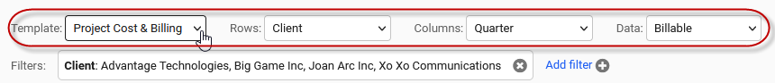
Refer to the table below for information on these fields.
|
Field name |
Use this field to... |
|---|---|
|
Template |
Select the category of data that will display in your chart, such as Project Cost & Billing or Time & Attendance data. |
|
Rows and Columns |
Select the fields whose data will be shown in your chart. Column versus row refers to how the data is formatted in the table that displays below the fields. In bar and pie charts, you can use the chart's display options to choose which of these fields is used, since only data for one field option can display in these chart formats. In these cases, the grand total for the chosen field will be used in the chart. In grouped bar and line charts, data for both fields can display in a chart. |
|
Data |
Select the type of data you want to include in your chart for the selected row and column. |
The data you can view is not restricted by your assigned licenses or permissions. For example, you can view project data if your organization has a project license, even if you aren’t assigned a project-related product in Replicon.
About the chart types and display options
There are four chart types available. The table below outlines when to use each type.
|
Chart type |
Typical usage |
|---|---|
|
Bar |
Used to compare data for discontinuous items. For example, you could use a bar chart to compare how many hours your company has billed for each project. |
|
Grouped Bar |
Used to compare data for discontinuous items, each broken down by a second factor. For example, you could set up a grouped bar chart showing profit for each client, broken down to show profit for each client project. The second factor can be shown as bars, or as stacked layers in a single bar. |
|
Pie |
Used to view parts of a whole. For example, you could set up a pie chart to view how much each department contributes to total cost. |
|
Line |
Used to track trends, usually of something continuous (such as time). For example, you could use a line chart to view profit for a project by month. |
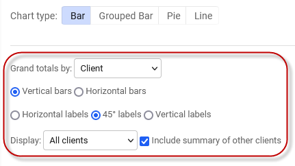
Each type of chart has a unique set of options for modifying how data displays.
FAQs about display options
|
What does the Grand totals by option, for bar and pie charts, mean? |
Both of these types of charts can only display data for one field (that is, one Row or Column drop-down selection). The Grand totals by option allows you to choose whether the row or column option you selected is used in the chart. The column selection is used by default if you don't update this display option. |
|
What does the X-axis option, available for grouped bar and line charts, mean? |
This option determines whether the Row or Column drop-down option you selected should display on the x-axis. |
|
What does the Grouped style option mean? |
This option determines whether grouped items are stacked into one bar, or shown as separate bars. In either case, the data bars or stacked layers are color coded. |
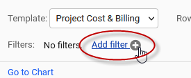
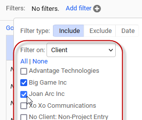
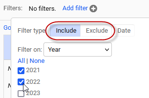
About the filter options
To filter what data appears in your chart:
- Click the Add filter link located beneath the data field drop-downs.
- Select which field you want to filter by from the drop-down.
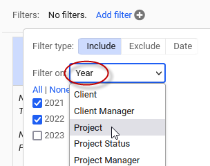
- Select the Include or Exclude tabs to check which specific items you want to either include or exclude from the chart data.
- Select the Date tab to choose relative time periods to view.
For example, you can choose to always see data for the last two months in your chart.
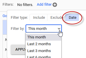
If you’d like to view fixed time periods in your chart, select the time period field and filter options available using the Include or Exclude tabs.
If you don’t choose a time range, all data in your system for all time periods will display.
You can also filter data that displays in your chart in two other ways:
- Click on a row in the data table to filter by that row item
- Click on a bar or slice of your chart to filter by that item.
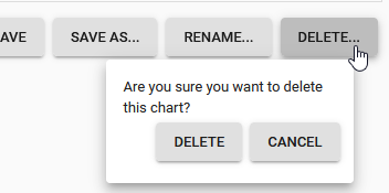
Deleting a chart
Before deleting a chart, note that dashboards are shared interfaces and others may be using the chart you want to delete.
To delete a chart from the dashboard itself, click the ![]() icon in the top, right-hand corner of the page, then click the
icon in the top, right-hand corner of the page, then click the ![]() that appears in the top right-hand corner of the chart you want to delete.
that appears in the top right-hand corner of the chart you want to delete.
To delete a chart from the chart editing page, select the chart from left side of the page, and then click the Delete button located on the right side of the page.
FAQs
Can I see just my own data, or all data for my company?
You can see all data for your company. When using the dashboard, your access to data isn't limited by your permissions and licenses as it is in the rest of the application. For example, if you don't have a project license, you'll still be able to see project-related data on the dashboard.
Is all time data included in charts, whether or not it's approved?
Yes, all data entered is displayed in charts.
Can I change the display order for charts on the dashboard?
Currently, charts display on the dashboard in the order they were created.
What data shows when I hover over a chart?
Hovering over a bar, pie slice, or line node will show the data for that item. For example, the number of hours worked on a particular project displays when you hover your cursor over a chart of hours by project.
What do the Go to Chart and Go to Table links mean?
These links simply take you to the top of the table or chart, and may be helpful if your data table is very long.
I'm having trouble seeing the chart labels
Try using the vertical or 45 degree labels. Or, if you're viewing a lot of items, try filtering your data.
Related links
Using dashboards
Using dashboards (video)
Adding and opening dashboards
Exporting dashboard charts and tables
Gaining business intelligence using your Replicon data